Kriptomat
Crypto for people who have never bought crypto.
- Client
- Kriptomat
- Role
- UI/UX Designer
- Years
- 2020-2021
- Platforms
- Web app, mobile app
- Scope
- Product design
The situation
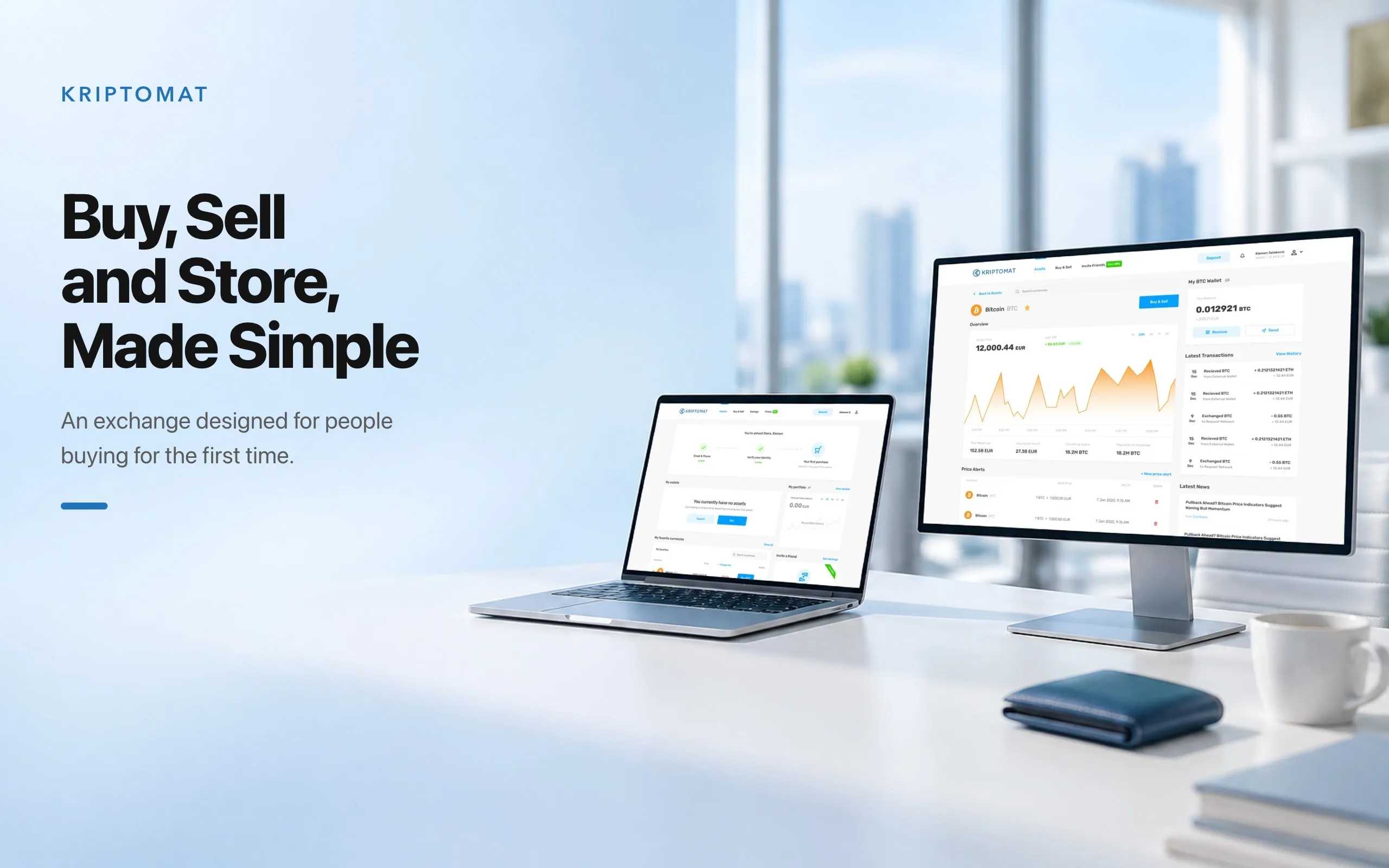
Kriptomat is a regulated European crypto exchange built for people who have never bought crypto. It sells hundreds of cryptocurrencies for euros, by card or bank transfer.
Regulation decides the order of things. Nobody can buy before their email, phone and identity are verified, and a new member meets those checks before they have seen anything worth staying for.
From 2020 to 2021 I designed the web app around that order: getting verified, signing in safely, and the first steps once the account is open.
The system behind it
- Data
- Accounts, identity checks, devices, euro deposits, wallets per currency, savings with an interest rate per currency, and transactions.
- Rules
- Email, phone and identity are verified before the first purchase. A new device is confirmed with a code. Savings pay interest only on crypto already held.
- People
- First-time buyers who don’t know the vocabulary, members who already hold crypto, and the compliance team that sets what must be checked.
Decisions
Verification shown as progress
What brokeIdentity checks arrive before any value. A new member who only sees a form, with no idea how much is left, leaves.
What I decidedThe home screen opens with three steps: email and phone, identity, first purchase. Each finished step turns green, and the greeting says how close the member is. Below it, the first purchase is offered two ways: deposit euros, or buy with a card.
The trade-offThe steps take the top of the home screen for every new member until the first purchase. Members who just want to look around have to scroll past them.
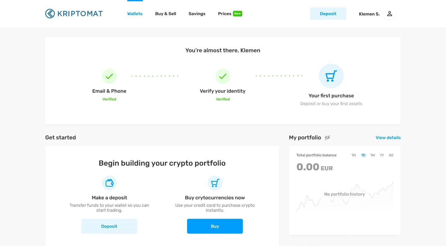
The checks the law requires, shown as steps already done. Safety you can see at sign-in
What brokePeople new to crypto are the easiest to phish, and a fake login page costs them everything.
What I decidedThe sign-in page shows the one address it should be on, with a padlock, above the form. A sign-in from a new device asks for a code sent by SMS to a masked number.
The trade-offAn extra step at every new device. For a wallet holding money, the friction is the feature.
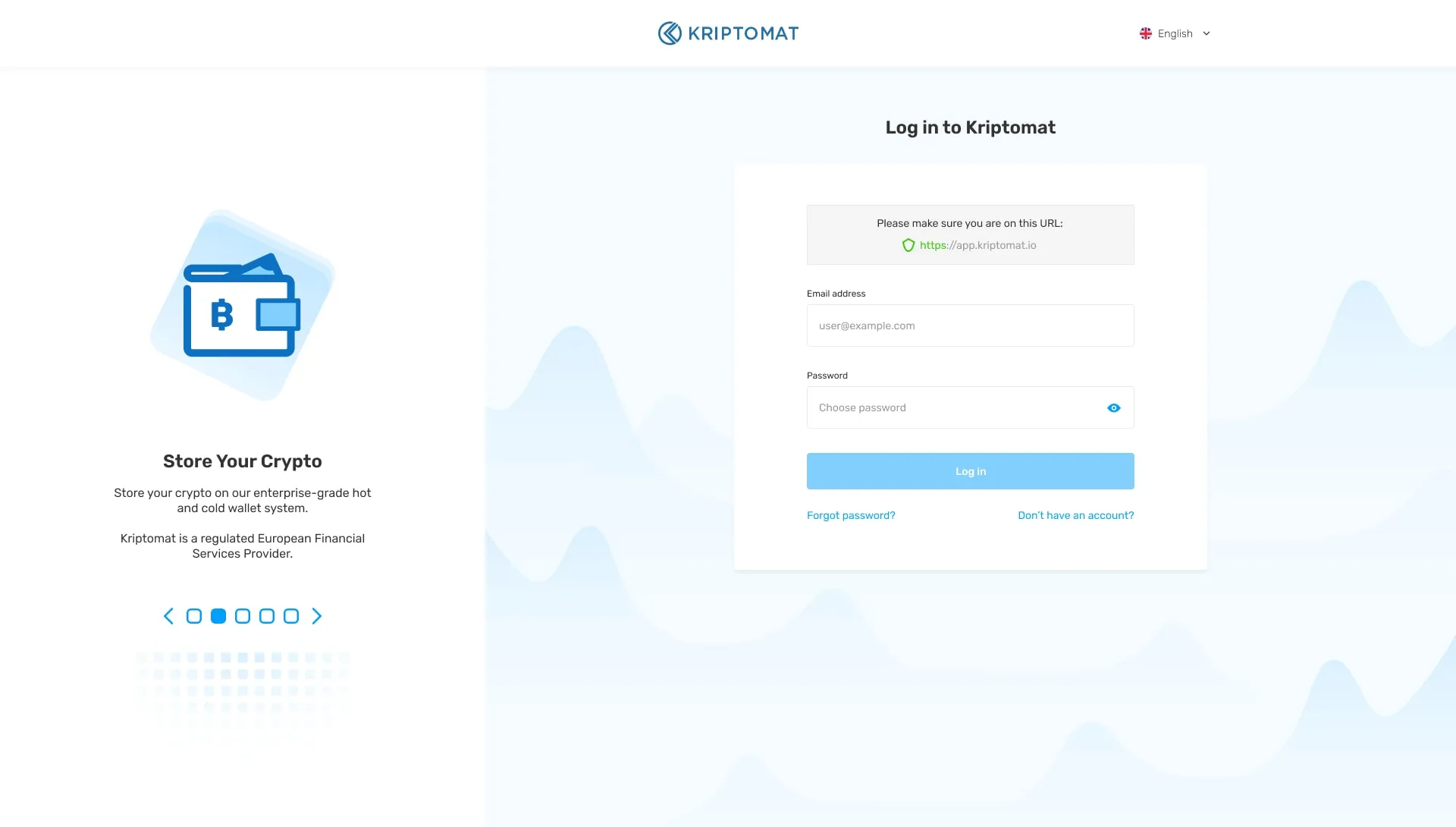
The address check sits above the form, where a phishing page can’t pretend. No dead ends for an empty account
What brokeA new account is all zeros. Empty wallets, an empty portfolio chart and no history tell a first-time buyer nothing about what to do.
What I decidedEvery empty area says what it is waiting for and offers the next step: “You currently have no assets” with Deposit and Buy, and a portfolio chart that shows “No portfolio history” instead of a flat line.
The trade-offTwo buttons, Deposit and Buy, ask the newcomer to know the difference. The labels under them carry that.
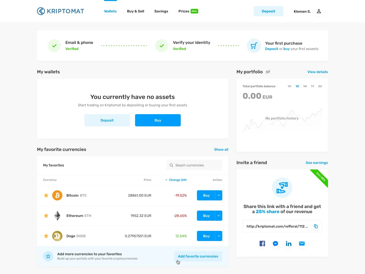
Zero balance, three ways forward. Earning starts from what you hold
What brokeInterest rates on their own invite people to buy something they don’t understand just for the rate.
What I decidedThe savings page lists each currency with its rate and the member’s balance in it. Currencies already held say Invest. The rest say Buy & Invest, so it’s clear when money is changing hands. A calculator shows the estimate in euros before anything is committed.
The trade-offHeadline rates still lead the page. The calculator is the honest part, and it sits on the side.
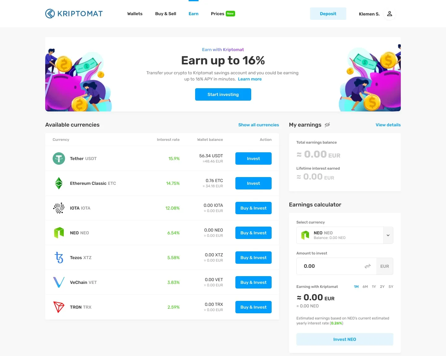
Invest for what you hold, Buy & Invest for what you don’t.
What changed
With verification moved ahead of the first purchase, drop-off at the first purchase fell from about 38% to 18%.
My part
I was the UI/UX Designer at Kriptomat from 2020 to 2021 and designed the web and mobile apps with the product team.
I used Hotjar and ran user research to find where newcomers stopped, and designed around what it showed.
More screens
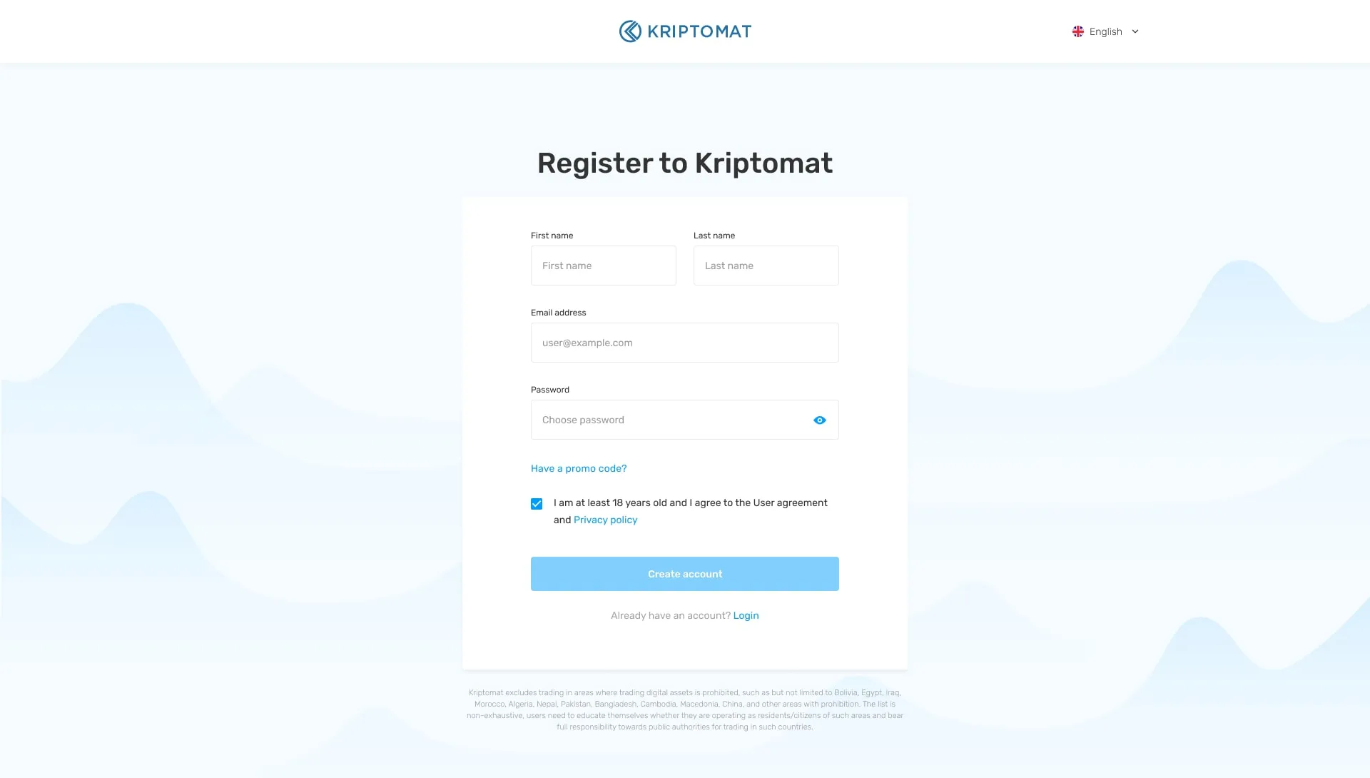
Registration asks only what an account needs. Verification comes after. 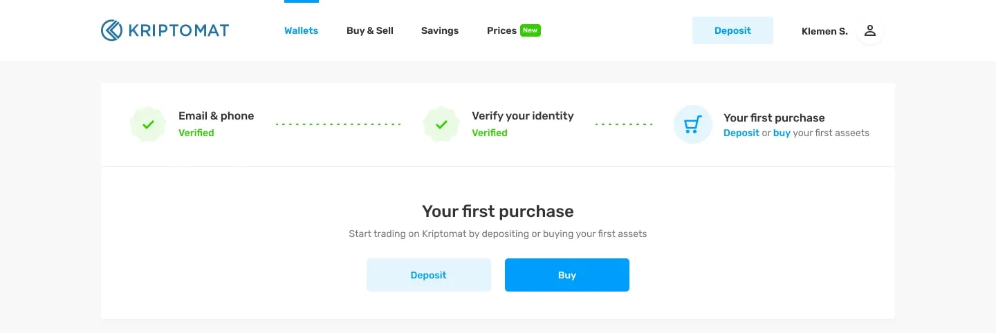
Once verified, the strip shrinks and the first purchase takes its place. 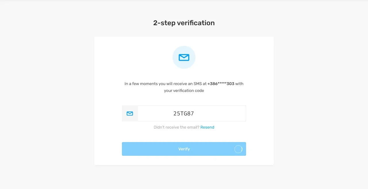
A new device needs a code before it sees any balance. 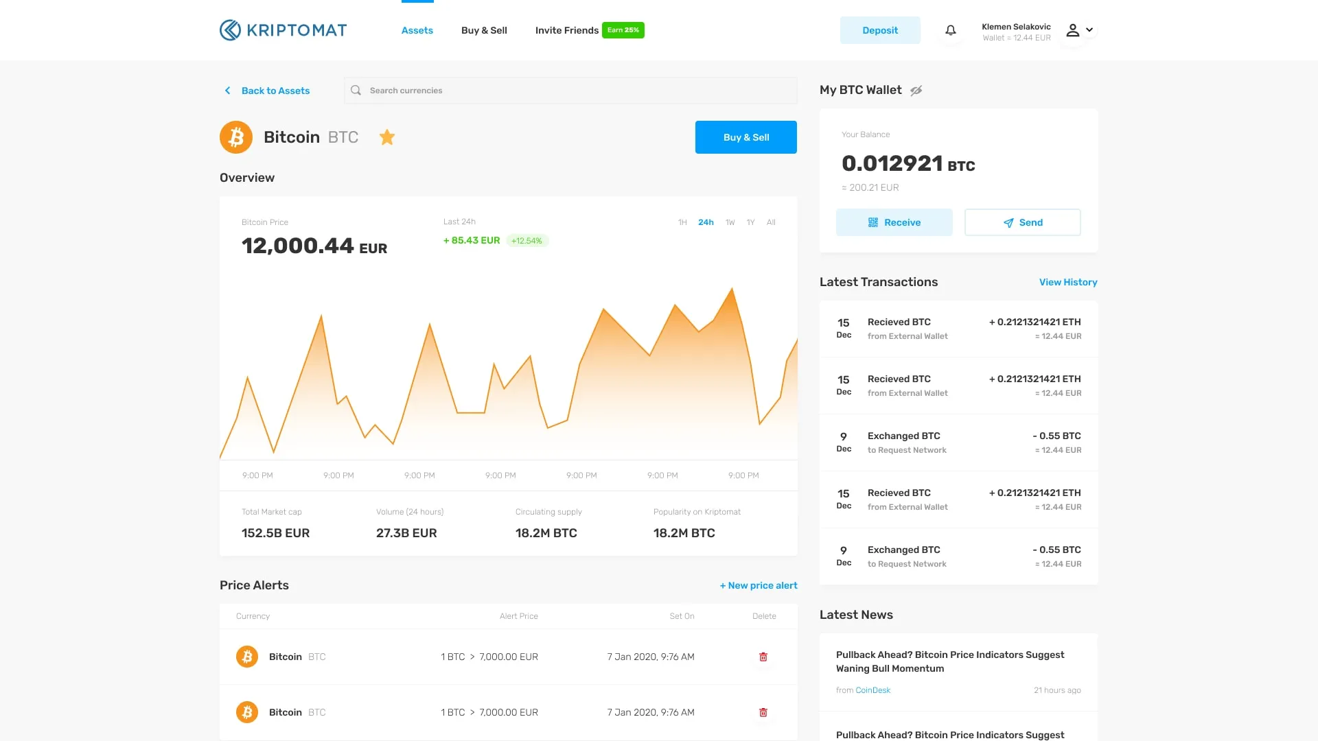
One coin: price, alerts, balance, and send or receive. 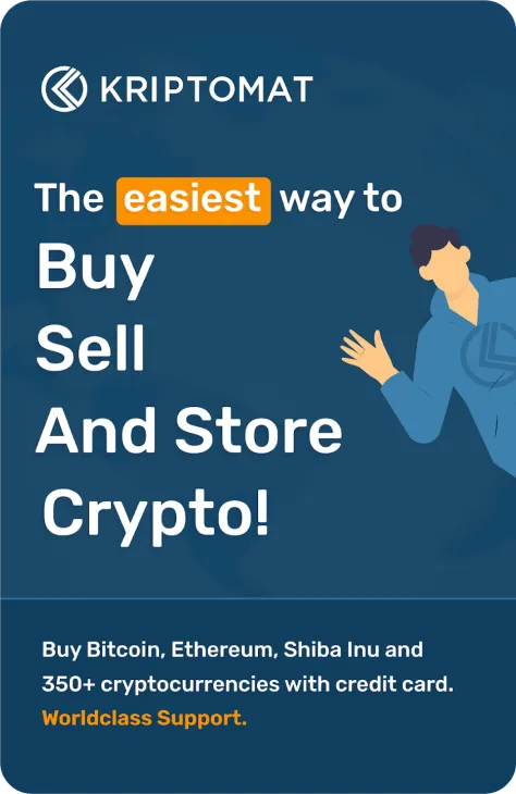
The mobile app. 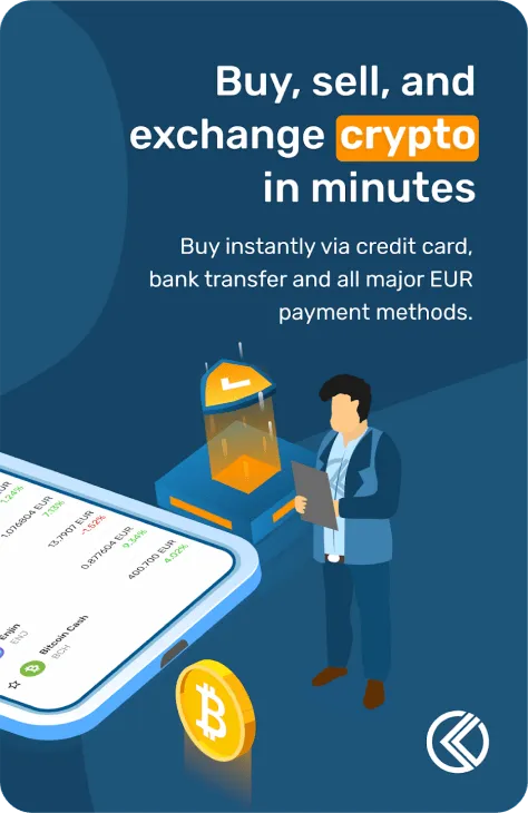
Buy by card, bank transfer or the main euro payment methods. 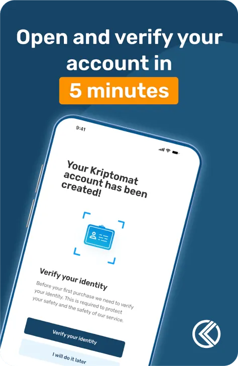
The mobile app: open and verify in five minutes. 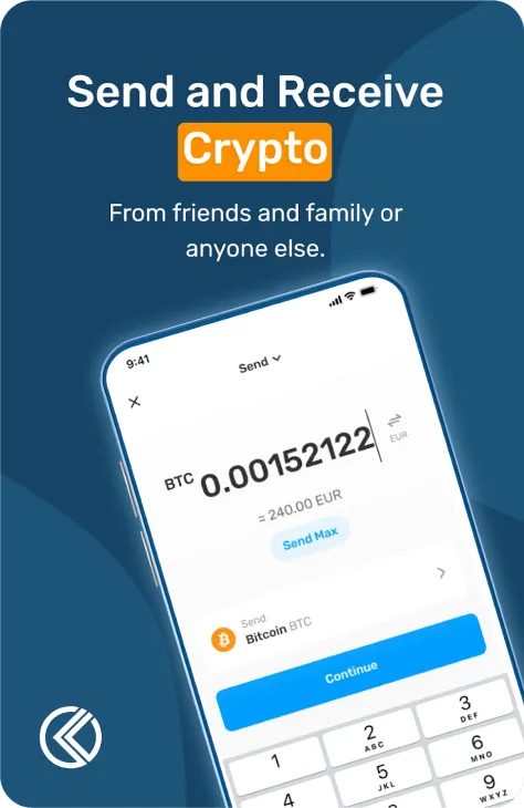
The mobile app: send and receive. 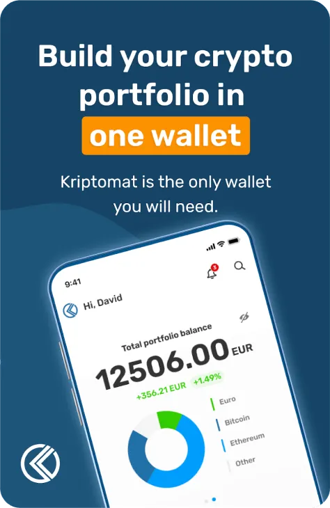
One wallet, one balance in euros.