


Too much technical jargon
Swap “Gas 14,000,000 GWEI” for “Network fee 1.4 EUR”, and write the interface the way you’d explain it to a friend.
Too much at once
Connect a wallet, pick a network, buy, stake, mint, sign. Guide people one step at a time and show their progress.
Users feel unsafe
“Approve transaction” makes people wonder if they’re handing over their funds. Say what they’re signing and why.
Silence after the click
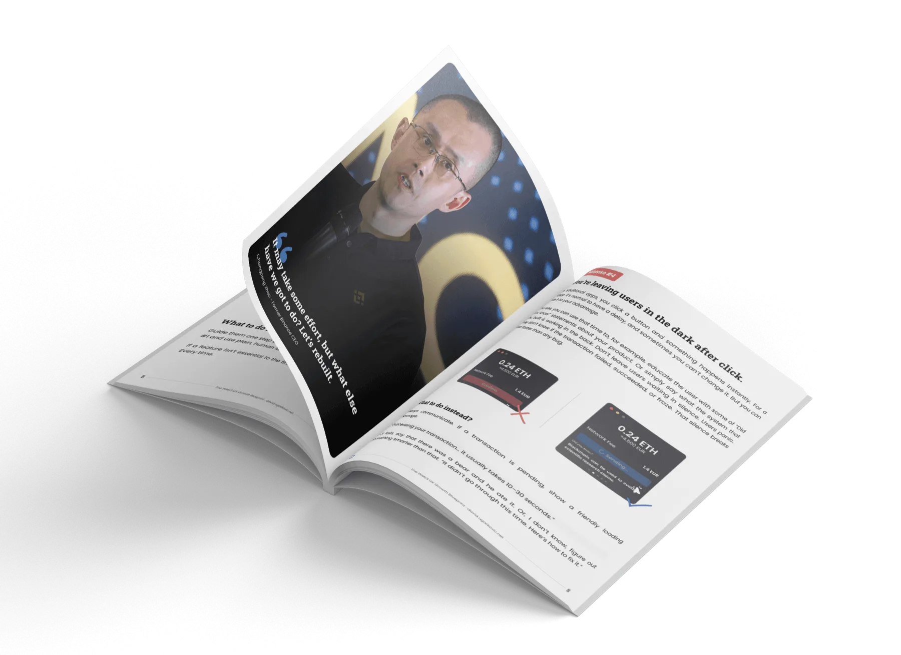
A transaction can take 10 to 30 seconds. Say so while it runs, and say what to do if it fails.
No moment of success
A first mint or swap deserves more than “Transaction confirmed”. Mark it, and show the next step.
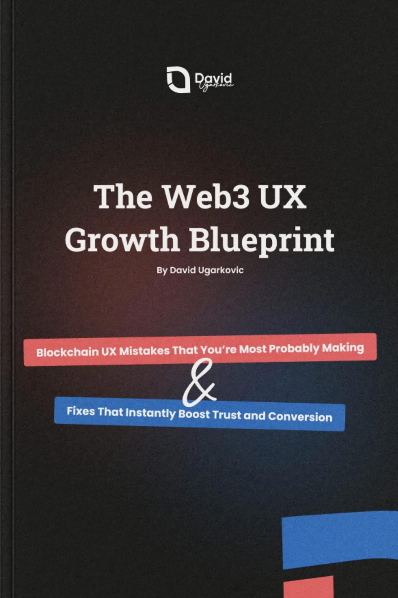
Web3 UX Growth Blueprint
A free 12-page guide to the five UX mistakes I see most in blockchain products, with a fix for each and a checklist to score your own product.
The five mistakes
The checklist
A 15-point checklist across clarity, trust, progress, simplicity and delight. Score your product from 1 to 5 on each point, before and after you change it.