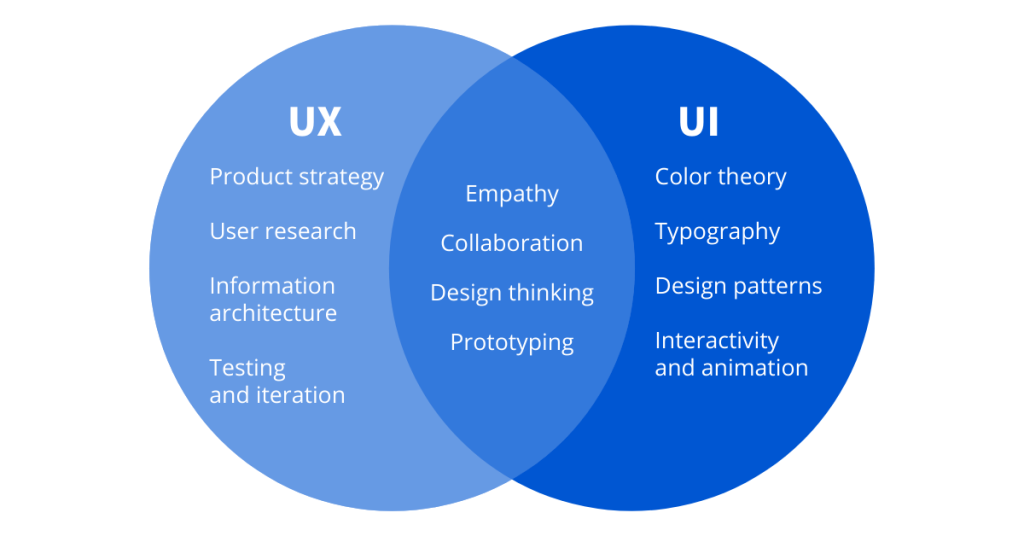
Nowadays, the internet has become overwhelmed with different acronyms, buzzwords, and specific expressions. That can make regular users feel confused and lost in the world of business slang. Frankly, an expression that you use, but don’t know the meaning will make you look… *insert nice word*… clumsy. Well, fear not, because today I will break the UX/UI jargon into pieces to give you all the necessary information.
Are The UX And UI The Same?
Not at all, but people get them mixed all the time. You can look at the UI as the sub-discipline of the UX, but with great differences. Confused you even more, huh? Great. Let’s get started on today’s lecture.
UI is the bridge that gets us where we want to go, UX is the feeling we get when we arrive.
Jason Ogle – Host and producer of User Defenders podcast, Designer at NCM
The User Experience – UX
User experience is, simplified, how the user feels when interacting with his surroundings. That can be anything, from a website to a trip to the museum.
Nowadays, the term “UX” is used mostly in the digital world, to describe the experience between the user and the product or service (webpage, mobile app, program, etc.).
This part of the experience doesn’t concentrate on the visual aspects, but mostly on practical ones.
The product must be:
- easy to interact with
- relevant
- efficient
- pleasant
- up to date
- reliable
To accomplish that, the UX designers must take a holistic approach to the problems. Besides just looking at the big picture (Gestalt Principles), the most important part is to listen to the user’s feedback.
After all, don’t forget you are making the product for a regular user, not for yourself.
User experience encompasses all aspects of the end-users interaction with the company, its services, and its products.
Don Norman, Cognitive Scientist & User Experience Architect
The User Interface – UI

The “user interface” term has had its fair share of misinterpretations, mostly because it’s a very wide field of work. But unlike user experience, the user interface is strictly focused on a digital world.
The user interface is the tool you use to interact with a certain device or service, like a touchscreen of the smartphone or the homepage of the website. The user interface includes the buttons or the icons in the app, the size, font, and looks of the text, screen layouts, in-app banners, color contrast, and much, much more.
Everything you see and can interact with within the app or the webpage is UI, and someone designed it to fulfill the user’s needs. UI designers must be good graphic designers, as their job is strictly visual. A good user interface must be:
- visually attractive
- stimulating
- in compliance with the purpose of the product
- harmonic
- aesthetic
- easy to remember
- have a responsive design
A user interface is like a joke. If you have to explain it, it’s not that good.
How to make UX and UI work together?
Despite their huge differences in skills and tasks, both the UX and UI have one thing in mind: user satisfaction. To accomplish that, UX and UI must be well balanced, harmonized, and have great communication.
The greatest interface in the world can’t save a bad or broken app, and the most well-built webpage will render worthless if its interface is designed too clunky or old-fashioned.

UX/UI Tips & Tricks
Three Clicks Rule
Most regular users will cease to use your webpage if they can’t complete their initial task within three clicks.
The F Pattern
Usually, the first thing the users read on the webpage is the two first headlines, followed by the starting words of each row of the text. You must keep their attention there, to encourage them to read the rest of the page.
Five-Second Test
The first impression is often the most important one when gathering new users. Test your webpage or app by showing it to the new users for 5 seconds, and you will find out what they noticed first, bad or good.
80/20 Principle
Also known as the Pareto principle, this simple mathematical theory teaches us that 20% of the good, functional features of UX/UI design will be responsible for 80% of the user interaction with that design.

